According to Jan, all of the advanced design student's work this week was terrible. For the most part, I agree. Maybe I should temporarily call this blog "sort of superfine design." I think the fact that our first assignment was to design layouts for an actual magazine, instead of a TA, added a sense of urgency and lack of forethought to some elements in my work this week.
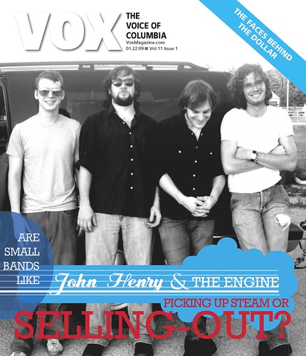
The VOX cover story was a spotlight on the new indie band trend of "selling out" their music to television networks. If you've watched the O.C., you'll recognize the Rooney and Death Cab for Cutie episodes where the bands did just that. And, oh God, I just noticed something. Does that dash need to be between the words "selling out?" I knew I should have taken editing last semester...
I stuck a publicity shot of the band on the cover because the story was primarily using John Henry and the Engine as an example of this new trend. However, I now realize the story was encompassing the trend itself, and using a band photo was too specific for the subject matter. The graphic was inspired by the band's logo, and I made a few changes to the color and layout to avoid copying the logo outright. I really like the how the colors pop and that it kind of looks like a guitar. Maybe?
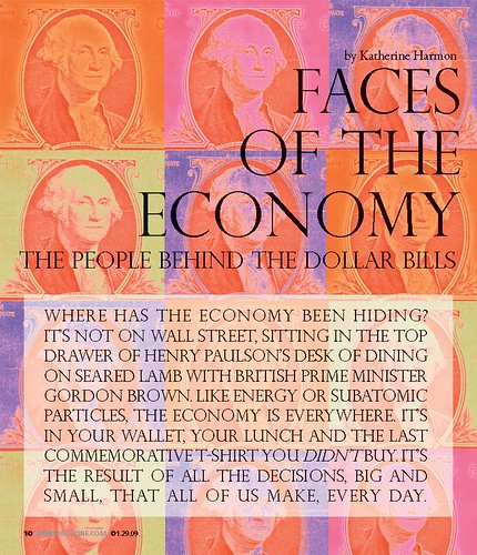
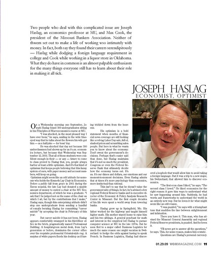
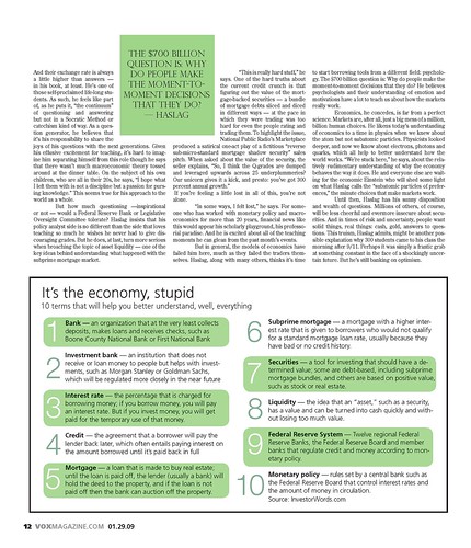
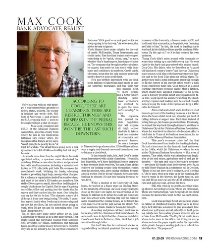


The feature story was about two very different men with very different financial viewpoints, but a very similar passion for all things economic. While the subject initially seemed a bit bland, I realized the whole point of the story was to bring the somewhat intangible subject of economics down to an easily understandable level that, yes, even I could understand. I tried to do the same with my design. While gimmicky, overdone and predictable, I thought the title "Faces of the Economy" screamed for a recognizable Warhol-inspired design. Were the multiple faces too literal? Perhaps. Do I think they look good and work with the headline? Yes.
Don't even get me started on the text itself, there was enough of it to fill ten pages. I wanted to keep the bulk of the spread simple, with a separate section for each of the men. In order to do that, I had to do something creative with the two opening paragraphs. In hindsight, I realize putting the entire first paragraph in capitals WAS A BIT INTENSE and I would put that in normal text format to prevent from scaring the reader away; exactly the opposite of a designer's intention. Off to a great start!
If the screaming sub-head didn't scare you away, you'll notice that I used green throughout the rest of the design to obviously reflect the monetary subject. I made it a lighter lime green to match the opening illustration and keep it fun. There is odd spacing around the bulk of the text, but I think the asymmetry and white space avoids being awkward and is successful in adding interest. The sidebar is huge and obnoxious, and I am not sure why there is a box around it. Needless to say, there will be a re-design coming soon.

No comments:
Post a Comment