Pages

January 31, 2009

Photo #1


These little Buddha pencil toppers came in a pack of six, so naturally I decided to place a different Buddha in six different locations because WHO CAN HAVE ENOUGH BUDDHAS?! Not me, apparently. The red one in my car has been sitting on my dashboard for almost six years now, while the purple desk-hopper has been around just as long but changes location with me each year. The tiny dude featured above has graced the deep cherry wood desk of my parent's computer room back in Iowa, the faux-particle board travesty that served as my dorm desk,  the white desk whose only job was to be a ladder up to my extremely lofted bed in the smallest room of the Delta Gamma house, and most recently the beautiful West Elm Parsons desk sitting in an even more beautiful downtown loft (downtown = the 8-square blocks of downtown CoMO, loft = elegant word for cramped, windowless apartment.)

January 29, 2009

Quick! Bookmark this.

In a final ode to the late Domino, here is the magazine's organized list of favorite design and interior decorating websites/blogs. While I still have a few years before I will actually be living in a house, this list will offer some fabulous  design inspiration for the cardboard box I will be inhabiting in New York for the next few years. Or, who knows, perhaps I'll end up at Dancing Rabbit Ecovillage located in the rolling Missouri hills. Or there's always Plan C — shell out the $500 for Rosetta, learn Italian and move to a cottage in the Tuscan countryside...avoiding all social contact because my Italian is so horrible. Wherever I end up, this list will surely help me make it beautiful. 


January 28, 2009

(Heart) Breaking News

Today is a sad, sad day...my favorite magazine has just folded. Domino is (was) a magazine dedicated to interior design, graphic design and fresh, young, eclectic style in general. It was already struggling as a bi-monthly magazine so I guess I shouldn't be too surprised it folded, but now my dream job of someday working there is destroyed! More importantly, how am I going to know what IKEA tables to buy this year!? Or what genre of animal skin is acceptable for 2009? Or where to find those sexy red tights Zooey's wearing!? Read more about the sadness here. One of my favorite bloggers, Joanna Goddard of "Cup of Jo", uses Domino for a lot of her blog inspiration.

AceJet Update

We all remember reading Penguin classic books, right? They used to look a little something like this...
In the late 90's, they moved towards a more modern design, integrating paintings from the Romantic, Baroque and Renaissance eras on many of their covers.


Acejet, my no-name British design friend of Ace Jet 170, noted that Penguin is returning to early graphic design trends with their latest book designs. 
They have designed a new batch of hardcover books in various ornate and graphic Victorian styles, using bold color combinations. My favorite is the navy and white (second from left), the grey and periwinkle (third from left), and the light blue and red (fourth from left.)  This is a great way for the books to appeal to their older, more seasoned readers who would like to artistically replace those old, tattered copies of their Penguin favorites. Plus, the colorful spines are a great way to add life to a bookshelf. Read more here.

January 27, 2009

Cute + Creepy = Crute

My most favorite genre of internet humor consists of an equal combination of cute and creepy. Both combine to become crute, which is embodied in the next link. Don't judge me.


While I am, and shall remain, a self-proclaimed pug person, I do have a penchant for cats (especially the ones that look like they smashed their faces into a wall.) This Japanese blog follows the daily life of three cats. While I cannot understand a word on the site, the photographs are great and the cats' various bodily arrangements make for fabulous design composition.


This Week in Design

According to Jan, all of the advanced design student's work this week was terrible. For the most part, I agree. Maybe I should temporarily call this blog "sort of superfine design." I think the fact that our first assignment was to design layouts for an actual magazine, instead of a TA, added a sense of urgency and lack of forethought to some elements in my work this week.


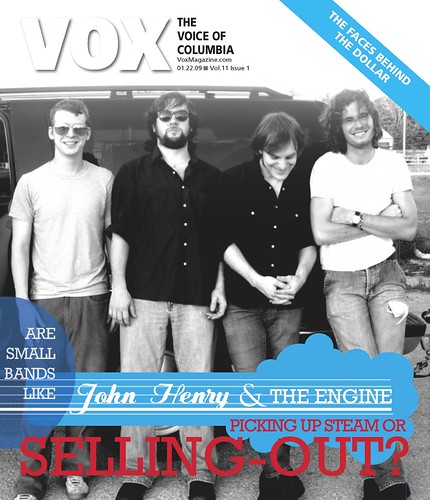
The VOX cover story was a spotlight on the new indie band trend of "selling out" their music to television networks. If you've watched the O.C., you'll recognize the Rooney and Death Cab for Cutie episodes where the bands did just that. And, oh God, I just noticed something. Does that dash need to be between the words "selling out?" I knew I should have taken editing last semester...

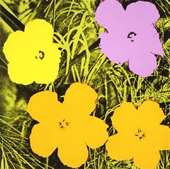
I stuck a publicity shot of the band on the cover because the story was primarily using John Henry and the Engine as an example of this new trend. However, I now realize the story was encompassing the trend itself, and using a band photo was too specific for the subject matter. The graphic was inspired by the band's logo, and I made a few changes to the color and layout to avoid copying the logo outright. I really like the how the colors pop and that it kind of looks like a guitar. Maybe?


economyfeat1_Page_1 by you.economyfeat1_Page_2 by you.

economyfeat1_Page_3 by you.
economyfeat1_Page_4 by you.


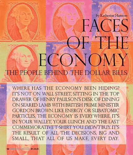
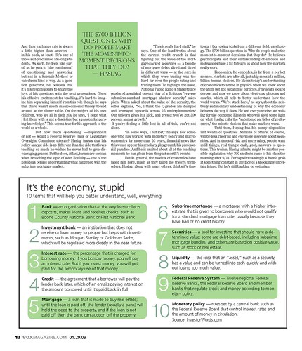
The feature story was about two very different men with very different financial viewpoints, but a very similar passion for all things economic. While the subject initially seemed a bit bland, I realized the whole point of the story was to bring the somewhat intangible subject of economics down to an easily understandable level that, yes, even I could understand. I tried to do the same with my design. While gimmicky, overdone and predictable, I thought the title "Faces of the Economy" screamed for a recognizable Warhol-inspired design. Were the multiple faces too literal? Perhaps. Do I think they look good and work with the headline? Yes.

Don't even get me started on the text itself, there was enough of it to fill ten pages. I wanted to keep the bulk of the spread simple, with a separate section for each of the men. In order to do that, I had to do something creative with the two opening paragraphs. In hindsight, I realize putting the entire first paragraph in capitals WAS A BIT INTENSE and I would put that in normal text format to prevent from scaring the reader away; exactly the opposite of a designer's intention. Off to a great start!

If the screaming sub-head didn't scare you away, you'll notice that I used green throughout the rest of the design to obviously reflect the monetary subject. I made it a lighter lime green to match the opening illustration and keep it fun. There is odd spacing around the bulk of the text, but I think the asymmetry and white space avoids being awkward and is successful in adding interest. The sidebar is huge and obnoxious, and I am not sure why there is a box around it. Needless to say, there will be a re-design coming soon.

January 22, 2009

Flowers


Flowers
Originally uploaded by cnl882
sweet flowers.